
A mobile website is designed and optimized for browsing on a smartphone. They come in various flavours: sometimes there are different desktop and mobile versions, other times they are the same. The focus of this article is on those websites that are specifically designed for “enhancing the mobile user experience”, although more often than not, it has the exact opposite effect.
 A mobile site
The sins presented in this article are so common that I’m sure readers must be able to relate to them. The most common complaints people have - or the 7 Deadly Sins of Mobile Websites - are drumroll:
- Slow to load
- Cluttered with text (Happy talk, Me Talk)
- Crappy navigation (Small buttons)
- Different content/theme from the Desktop version? (“Honey, where did the categories go?”)
- Popups
- Auto Redirect
- Advertisements and Banners
The 1st deadly sin: Slow to Load
It’s a well-known phenomenon that website loading time is a crucial factor in determining the site’s success. Websites that are slow by virtue of loading high resolution images (even worse, whole carousel full of images), useless piles of Javascript crap, will lead to abandonment.
 Wait… wait… wait for it…
I have decided not to sound like a broken record. Instead I will leave you with this rather fine point to ponder: A percentage of users browsing mobile websites are using slower connections like EDGE or 3G, not the fast Wifi we have in our homes and offices. So while a website may take 4 seconds to load on desktop, it might take longer than that to load on the mobile.
The 2nd deadly sin: Cluttered with Text
Websites guilty of this vice try to cram too much un-necessary text to look busy, put happy talk (“Welcome to my sweet, lovely website”) or what I like to call “me” talk (“We are very happy to receive the elusive Greatness-Trophy thanks to the hard work and dedication of our CEO”). The average user who arrived on Acme Widget’s website to check hours of operation don’t give a fat f*ck about their head of marketing’s epiphanies.
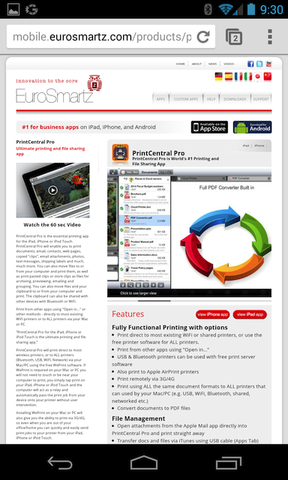 Time to bring out the Magnifier
In real life, we like people who are articulate. They speak fluently, coherently and get their thoughts across in a concise manner. Why should websites be any different?
 This looks like dog’s hairy behind!
The 3rd deadly sin: Crappy Navigation
Hidden menus, hover objects, small buttons, small radio buttons, buttons that are too close to each other, the list goes on. Imagine, you’re travelling in a municipal bus which is jerking you around like no roller coaster would, while you are trying to upvote the new kitten video. But you can’t land your finger on the damn button. Every time you try, it opens the link besides that button - every link left or right seems to work and no matter how hard you try. And who do you blame for your misery: your. fat. fingers.
 Will I get it to land on the right link this time?
The 4th deadly sin: Different Content/Theme from the Desktop Version
Often times, the mobile website looks so different from the desktop version that I start wondering if I’m the right website. If the mobile website has a very different layout and navigation, it’s asking users to go through another learning curve. No thanks.
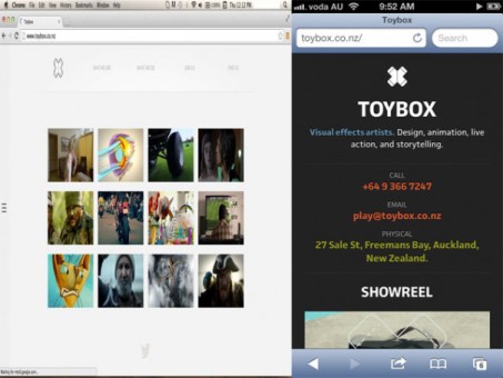 Desktop vs Mobile version. Is this the same site? Where did the content go?
The 5th deadly sin: Popups
Ah, the joy of having a huge box in front of my face telling me how good the App is and I should get it from the App Store. The irony: I already have the steaming pile of sh*t app installed and much rather use the website. How about I just leave instead?
 The content is behind there. Somewhere.
Chris Lake makes some compelling points against the Popup Syndrome, summarized in this fantastic statement:
A link should be a promise: you click one to be taken to a specific page. That’s just how it is, and it’s what every web user expects (unless programmed to expect something different, e.g. Forbes, which I no longer visit). Websites that lead you down the garden path before fulfilling the promise only serve to disappoint users.
Need I say more? Popups are so bad on mobile websites they should be banned altogether and erased from existence.
The 6th deadly sin: Auto Redirect
At first, it sounds like a novel idea: redirect users to mobile optimized or iPad optimized website based on the type of device/browser they are using. If done right and you have a great mobile website, it works great. The problem is when the mobile website sucks, users who just want to use the desktop version instead will get agitated if they don’t get what they want. I become very annoyed whenever sites ask me to make the very important decision to choose between “The Mobile Version”, “The Desktop Version”, or “Get the App” every single time.
But what makes auto redirect an absolute sin is faulty redirects. As Yoshikiyo Kato writes in this post:
A faulty redirect is when a desktop page redirects smartphone users to an irrelevant page on the smartphone-optimized website. A typical example is when all pages on the desktop site redirect smartphone users to the homepage of the smartphone-optimized site.
For example, in the figure below, the redirects shown as red arrows are considered faulty.

In fact, faulty redirection is so bad that there are reports suggesting that Google penalizes websites guilty of this sin in terms of their page rank.
The 7th deadly sin: Advertisement & Banner Ads
How could anyone ever even think about jamming in bunch of advertisement even with that much limited screen real-estate? Some people think putting banners on websites is a wise idea. News Flash - Banner ads are trouble. This is 2016, not 1999.
Banner ads suck say guys who invented banner ads. Nuff said.
 Last time we had little success with one banner. This time, let’s double up the banners.
Double check ads to make sure they don’t appear like these on smartphones.
Well there you have it, The 7 deadly sins of mobile websites. I hope you found this list useful. If you are guilty of committing these sins, don’t feel bad. As Robert Zoellick said:
All of us make mistakes. The key is to acknowledge them, learn, and move on. The real sin is ignoring mistakes, or worse, seeking to hide them.