CodeAhoy website has been redesigned!
When I launched CodeAhoy in 2016, I wanted to keep things simple and clean. My previous blog on Wordpress had become a cluttered mess and was really slow, especially on mobile devices. I was also bored with Wordpress and wanted to try something different.
Then I stumbled upon Jekyll. For those of you who aren’t familiar with it, Jekyll is a super easy static site generator for blogs. It takes your markdown files (and some configuration) and spits out a complete HTML website. The icing on the cake was that GitHub Pages supported Jekyll as one of the blog engines, which makes sense because Jekyll is written by one of the co-founders of GitHub.
So it was a no brainer. I chose Jekyll.
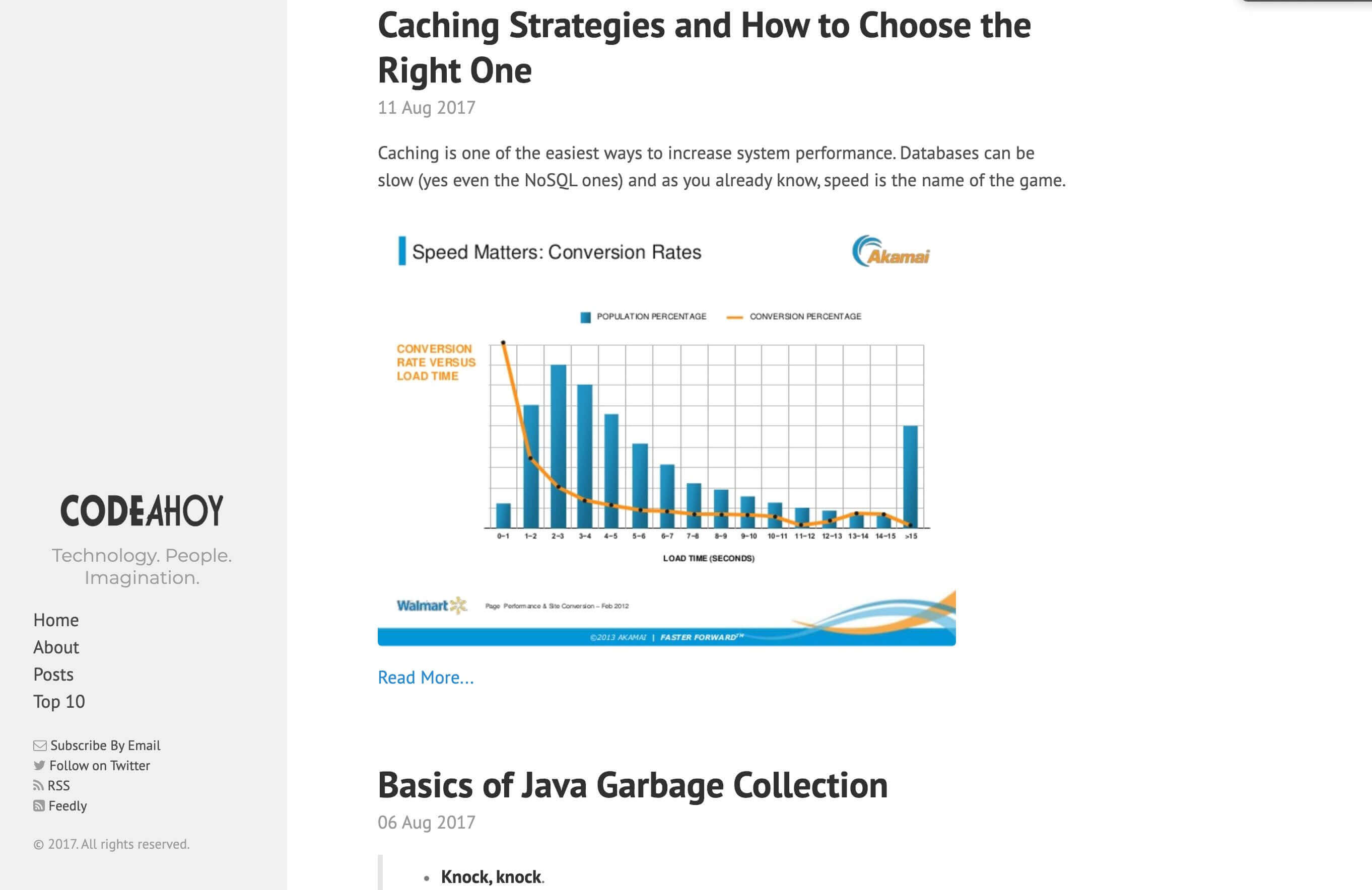
The next thing I needed was a theme. Jekyll didn’t have the same number and variety of themes and plugins available like Wordpress. But I did end up finding a theme that I liked. The theme itself was pretty simple, two-column layout. One column for the left sidebar, which always stayed in place, and the second displayed the main content, i.e., the blog post. It was clean, and did I already mention simple?
After applying the theme and releasing my blog, this was the end result.

I liked it because of the focus on readability. But over time, my affinity for the theme was reduced to a glimmer. What did I not like about the design? Well for starters, it wasn’t mobile-friendly. (Or may, it got so after my tweaks to the CSS… I don’t remember.) On mobile devices, the sidebar moves to the top of the page, taking up half the screen real-estate.
The second challenge I had once I had a good number of posts on my blog was that there was no room to display meta content like new or related blog posts and ads on the page. I was not too fond of the idea of embedding these things in the blog post itself. What I wanted was a thin right sidebar to display these things. I made up my mind that I’ll change the layout but got busy with other things so the idea collected dust.
Finally, I decided it is time to revamp the design finally. It was beginning to look pretty ancient and mobile usability was just horrible. So on the President’s Day long weekend, I made it my goal to get it done finally. My requirements from the new design were:
- mobile-first
- keep the focus on readability. Put content first.
- Less cruft for improved page load speeds.
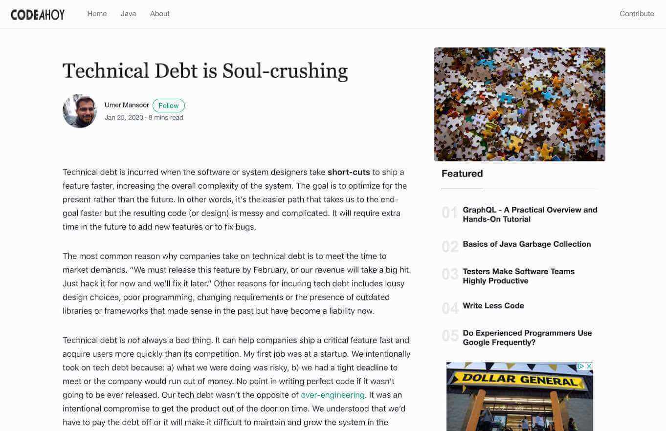
- For blog posts, I wanted a layout that has: a top navbar, and two-column layout for the main area. The left column will be much bigger and I will use it to show blog posts. The smaller right column is where I’d display meta content like features posts etc.
With the new requirements in mind, I set off to find the right Jekyll theme. I imagined that after so many years and improved Jekyll adoption courtesy of GitHub, I’d have better luck at finding the right theme quickly. I was wrong.
I searched for many hours. I looked for both paid and unpaid themes. I couldn’t find anything that met my criteria. I was contemplating just giving up and to build my own theme from scratch (Bootstrap,) I decided to go through my shortlist of candidates. On second look, a Medium-styled theme called Mundana really stood out. The design was clean and very close to what I wanted. It was missing a right sidebar that I wanted, plus it had some cruft that I wanted to get it out. I also didn’t like animations and transitions so much. I checked its license, and since it was MIT, I made up my mind to tweak it to meet my requirements.
Plug. Mundana is built by WowThemes. These guys have some really cool Jekyll (and Wordpress) theme. Check them out.
Back to the redesign story. Actually, I’ll just give you a summary: it has been a while since I used Bootstrap, which I didn’t realize when I thought I’ll be able to finish the redesign in a day. It ended up taking twice as long and I’m still not done. Thankfully, I remembered how flexboxes work and that was my saving grace. This is what the final result looked like:

Am I happy with it? Not really. It doesn’t look bad but it can be improved. The Jumbotron displaying the blog post title, author and featured image doesn’t feel right and it is something I plan on fixing next. I also want to improve the theme’s performance by removing cruft like JQuery, and other CSS/JS files I don’t need. I also want to use async and defer for JS file to improve first component paint times. I want the navbar to be stick on mobile. A lot of work but I’ll chip away.
I’m making my changes available for free for anyone to use. If you want to contribute, you’re welcome to do so! If you’ve any questions about the theme, feel free to message me (Twitter).
World, meet Portal.
Portal Jekyll Theme
Portal is a mobile-first Jekyll theme for technical blogs and websites. The source code is available at: https://github.com/umermansoor/Portal-Jekyll-Theme
Features
- Modified Boostrap 4.1 theme
- Complete Jekyll integration
- About Me and Author pages
- Sitemap, Feed and Atom
- robots.txt
- Easy mailchimp integration for newsletter sign-ups
- Easy Disqus integration
How to use
These instructions assume you have Jekyll installed on your machine.
- Clone the git repo
git clone https://github.com/umermansoor/Portal-Jekyll-Theme.git
- Start the theme with sample blog contents
jekyll serve --watch
If everything works as expected, you should be able to see it by visiting http://127.0.0.1:4000/index.html. I have added some sample blog posts and content to illustrate the design.
 Technical Debt is Soul-crushing