Related Books


Books / The basics of R / Chapter 8
Data Visualization using ggplot2
1. Good data visualisation and ggplot2 syntax
We’ve learned how to import our datasets in RStudio, and format and manipulate them, and now it’s time we talk about communicating the results of our analyses - data visualisation! When it comes to data visualisation, the package ggplot2 by Hadley Wickham has won over many scientists’ hearts. In this tutorial, we will learn how to make beautiful and informative graphs and how to arrange them in a panel. Before we tackle the ggplot2 syntax, let’s briefly cover what good graphs have in common.
| Step | Description | Notes |
|---|---|---|
| 1. | Appropriate plot type for results | Might be a boxplot, a scatterplot, a linear regression fit ... many options |
| 2. | Plot is well organised | The independent (explanatory) variable is on the x and the dependent (respnse) variable is on the y axis |
| 3. | X and Y axes use correct units | Having proper symbols (for alpha, beta, etc.) and super/subscript where needed |
| 4. | X and Y axes easy to read | Beware awkward fonts and tiny letters |
| 5. | Clear informative legend | It's easy to tell apart what points/lines on the graph represent |
| 6. | Plot is not cluttered | Don't put all results on one plot, give them space to shine |
| 7. | Clear and consistent colour scheme | Stick with the same colours for the same variables, avoid red/green combinations which might look the same to colourblind people |
| 8. | Plot is the right dimensions | Avoid overlapping labels and points/lines which merge together and make your graph longer/wider if needed |
| 9. | Measures of uncertainty where appropriate | Error bars, confidence and credible intervals, remember to say in the caption what they are |
| 10. | Concise and informative caption | Remember to include what the data points show (raw data? Model predictions?), what is the sample size for each treatment, the effect size and what measure of uncertainty accompanies it |
ggplot2 is a great package to guide you through those steps. The gg in ggplot2 stands for grammar of graphics. Writing the code for your graph is like constructing a sentence made up of different parts that logically follow from one another. In a more visual way, it means adding layers that take care of different elements of the plot. Your plotting workflow will therefore be something like creating an empty plot, adding a layer with your data points, then your measure of uncertainty, the axis labels, and so on.
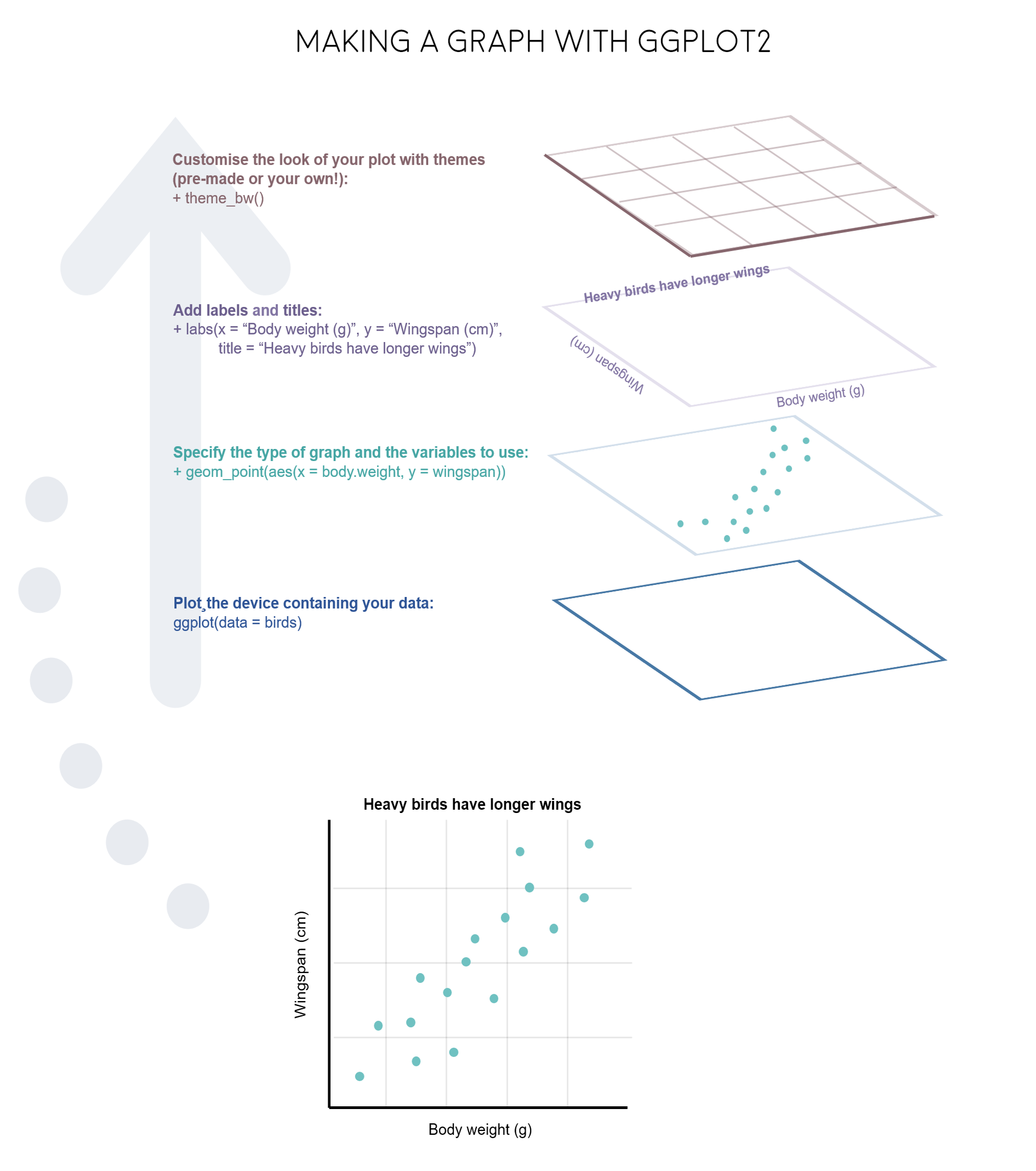 Just like onions (and ogres!), graphs in ggplot2 have layers.
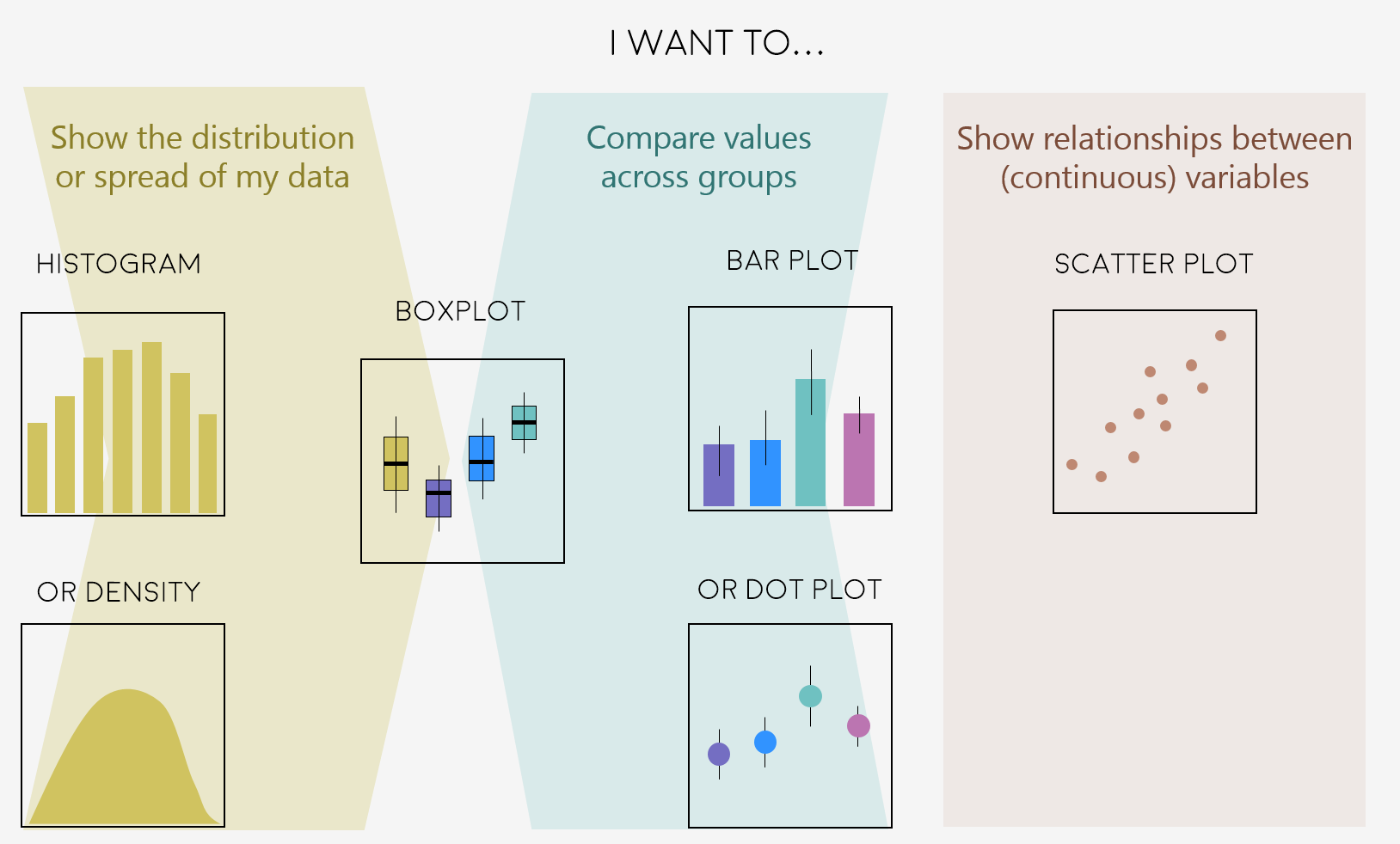
2. Decide on the right type of plot
A very key part of making any data visualisation is making sure that it is appropriate to your data type (e.g. discrete vs continuous), and fits your purpose, i.e. what you are trying to communicate!
You can start with our simple guide for common graph types, and visit the R Graph Gallery, a fantastic resource for ggplot2 code and inspiration!
 “Feeling inspired? Let’s make these graphs!”
3. Making different plots with ggplot2
Open RStudio, select File/New File/R script and start writing your script with the help of this tutorial.
# Purpose of the script
# Your name, date and email

# Your working directory, set to the folder you just downloaded from Github, e.g.:
setwd("~/Downloads/CC-4-Datavis-master")

# Libraries - if you haven't installed them before, run the code install.packages("package_name")
library(tidyr)
library(dplyr)
library(ggplot2)
library(readr)
library(gridExtra)
We will use data from the Living Planet Index, which you have already downloaded from the Github repository (Click on Clone or Download/Download ZIP and then unzip the files).
# Import data from the Living Planet Index - population trends of vertebrate species from 1970 to 2014
LPI <- read.csv("LPIdata_CC.csv")
The data are in wide format - the different years are column names, when really they should be rows in the same column. We will reshape the data using the gather() function from the tidyr package, something we cover in our basic data manipulation.
# Reshape data into long form
# By adding 9:53, we select columns 9 to 53, the ones for the different years of monitoring
LPI2 <- gather(LPI, "year", "abundance", 9:53)
View(LPI2)
There is an ‘X’ in front of all the years because when we imported the data, all column names became characters. (The X is R’s way of turning numbers into characters.) Now that the years are rows, not columns, we need them to be proper numbers, so we will transform them using parse_number() from the readr package.
LPI2$year <- parse_number(LPI2$year)

# When manipulating data it's always good check if the variables have stayed how we want them
# Use the str() function
str(LPI2)

# Abundance is also a character variable, when it should be numeric, let's fix that
LPI2$abundance <- as.numeric(LPI2$abundance)
This is a very large dataset, so for the first few graphs we will focus on how the population of only one species has changed. Pick a species of your choice, and make sure you spell the name exactly as it is entered in the dataframe. In this example, we are using the “Griffon vulture”, but you can use whatever species you want. To see what species are available, use the following code to get a list:
unique(LPI2$Common.Name)
Now, filter out just the records for that species, substituting Common.Name for the name of your chosen species.
vulture <- filter(LPI2, Common.Name == "Griffon vulture / Eurasian griffon")
head(vulture)

# There are a lot of NAs in this dataframe, so we will get rid of the empty rows using na.omit()
vulture <- na.omit(vulture)
3a. Histograms to visualise data distribution
We will do a quick comparison between base R graphics and ggplot2 - of course both can make good graphs when used well, but here at Coding Club, we like working with ggplot2 because of its powerful customisation abilities.
# With base R graphics
base_hist <- hist(vulture$abundance)
To do the same with ggplot, we need to specify the type of graph using geom_histogram(). Note that putting your entire ggplot code in brackets () creates the graph and then shows it in the plot viewer. If you don’t have the brackets, you’ve only created the object, but haven’t visualized it. You would then have to call the object in the command line, e.g. by typing vulture_hist after creating the object.
# With ggplot2: creating graph with no brackets
vulture_hist <- ggplot(vulture, aes(x = abundance))  +
  geom_histogram()

# Calling the object to display it in the plot viewer
vulture_hist

# With brackets: you create and display the graph at the same time
(vulture_hist <- ggplot(vulture, aes(x = abundance))  +
  geom_histogram())


# For another way to check whether your data is normally distributed, you can either create density plots using package ggpubr and command ggdensity(), OR use functions qqnorm() and qqline()
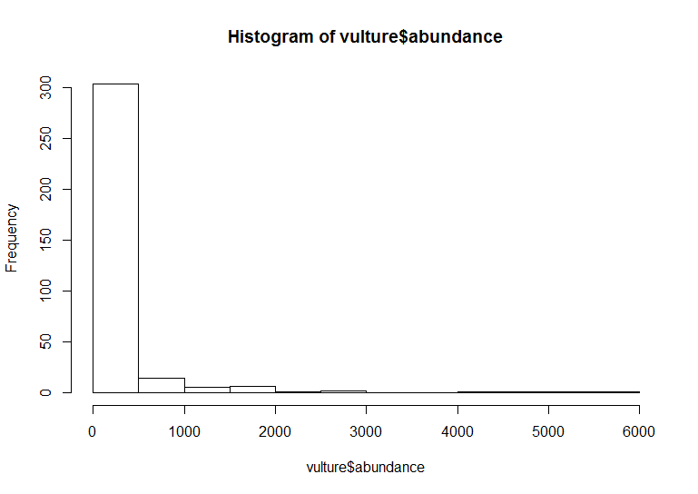
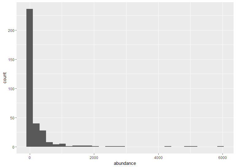
The default ggplot settings (right) are not ideal: there is lots of unnecessary grey space behind the histogram, the axis labels are quite small, and the bars blend with each other. Lets beautify the histogram a bit! This is where the true power of ggplot2 shines.
(vulture_hist <- ggplot(vulture, aes(x = abundance)) +
  geom_histogram(binwidth = 250, colour = "#8B5A00", fill = "#CD8500") +    # Changing the binwidth and colours
  geom_vline(aes(xintercept = mean(abundance)),                       # Adding a line for mean abundance
             colour = "red", linetype = "dashed", size=1) +           # Changing the look of the line
    theme_bw() +                                                      # Changing the theme to get rid of the grey background
  ylab("Count\n") +                                                   # Changing the text of the y axis label
  xlab("\nGriffon vulture abundance")  +                              # \n adds a blank line between axis and text
  theme(axis.text = element_text(size = 12),                          # Changing font size of axis labels and title
        axis.title.x = element_text(size = 14, face = "plain"),       # face="plain" is the default, you can change it to italic, bold, etc.
        panel.grid = element_blank(),                                 # Removing the grey grid lines
        plot.margin = unit(c(1,1,1,1), units = , "cm")))              # Putting a 1 cm margin around the plot

# We can see from the histogram that the data are very skewed - a typical distribution of count abundance data
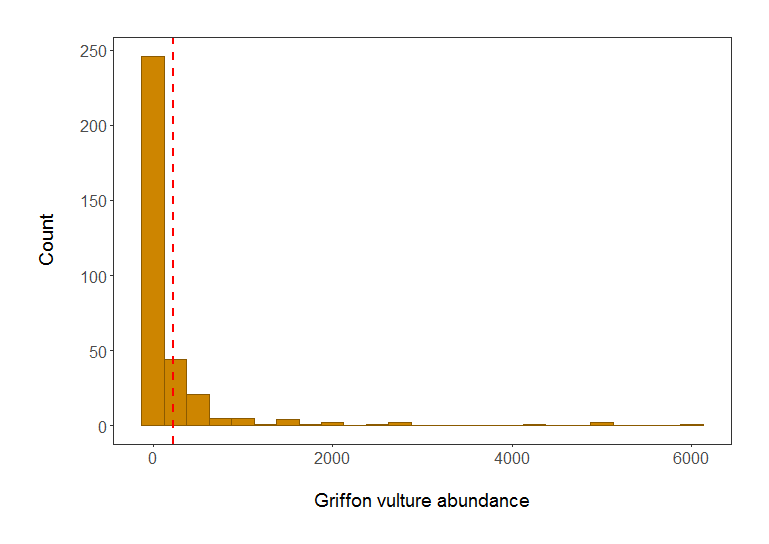 Histogram of Griffon vulture abundance in populations included in the LPI dataset. Red line shows mean abundance. Isn’t it a much better plot already?
Note: Pressing enter after each “layer” of your plot (i.e. indenting it) prevents the code from being one gigantic line and makes it much easier to read.
Understanding ggplot2’s jargon
Perhaps the trickiest bit when starting out with ggplot2 is understanding what type of elements are responsible for the contents (data) versus the container (general look) of your plot. Let’s de-mystify some of the common words you will encounter.
geom: a geometric object which defines the type of graph you are making. It reads your data in the aesthetics mapping to know which variables to use, and creates the graph accordingly. Some common types are geom_point(), geom_boxplot(), geom_histogram(), geom_col(), etc.
aes: short for aesthetics. Usually placed within a geom_, this is where you specify your data source and variables, AND the properties of the graph which depend on those variables. For instance, if you want all data points to be the same colour, you would define the colour = argument outside the aes() function; if you want the data points to be coloured by a factor’s levels (e.g. by site or species), you specify the colour = argument inside the aes().
stat: a stat layer applies some statistical transformation to the underlying data: for instance, stat_smooth(method = 'lm') displays a linear regression line and confidence interval ribbon on top of a scatter plot (defined with geom_point()).
theme: a theme is made of a set of visual parameters that control the background, borders, grid lines, axes, text size, legend position, etc. You can use pre-defined themes, or use a theme and overwrite only the elements you don’t like. Examples of elements within themes are axis.text, panel.grid, legend.title, and so on. You define their properties with elements_...() functions: element_blank() would return something empty (ideal for removing background colour), while element_text(size = ..., face = ..., angle = ...) lets you control all kinds of text properties.
Also useful to remember is that layers are added on top of each other as you progress into the code, which means that elements written later may hide or overwrite previous elements.
Learning how to use colourpicker
In the code above, you can see a colour code colour = "#8B5A00" - each colour you can dream of has a code, called a “hex code”, a combination of letters and numbers. You can get the codes for different colours online, from Paint, Photoshop or similar programs, or even from RStudio, which is very convenient! There is an RStudio Colourpicker addin which was a game changer for us - to install it, run the following code:
install.packages("colourpicker")
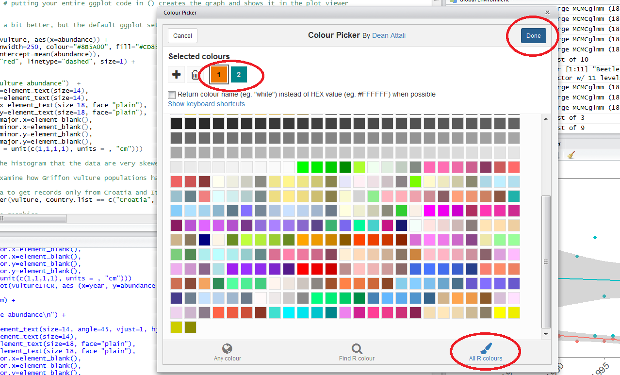
To find out the code for a colour you like, click on Addins/Colour picker.
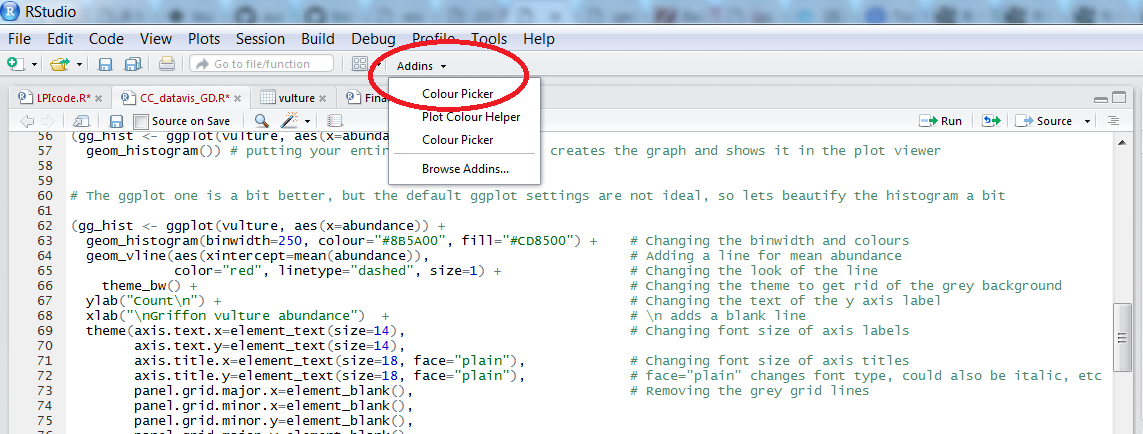
When you click on All R colours you will see lots of different colours you can choose from - a good colour scheme makes your graph stand out, but of course, don’t go crazy with the colours. When you click on 1, and then on a certain colour, you fill up 1 with that colour, same goes for 2, 3 - you can add more colours with the +, or delete them by clicking the bin. Once you’ve made your pick, click Done. You will see a line of code c("#8B5A00", "#CD8500") appear - in this case, we just need the colour code, so we can copy that, and delete the rest. Try changing the colour of the histogram you made just now.
3b. Scatter plot to examine population change over time
Let’s say we are interested in how the Griffon vulture populations have changed between 1970 and 2017 in Croatia and in Italy.
# Filtering the data to get records only from Croatia and Italy using the `filter()` function from the `dplyr` package
vultureITCR <- filter(vulture, Country.list %in% c("Croatia", "Italy"))
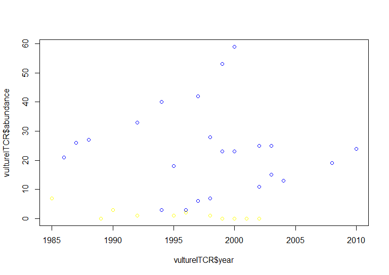
# Using default base graphics
plot(vultureITCR$year, vultureITCR$abundance, col = c("#1874CD", "#68228B"))
# Using default ggplot2 graphics
(vulture_scatter <- ggplot(vultureITCR, aes(x = year, y = abundance, colour = Country.list)) + # linking colour to a factor inside aes() ensures that the points' colour will vary according to the factor levels
geom_point())
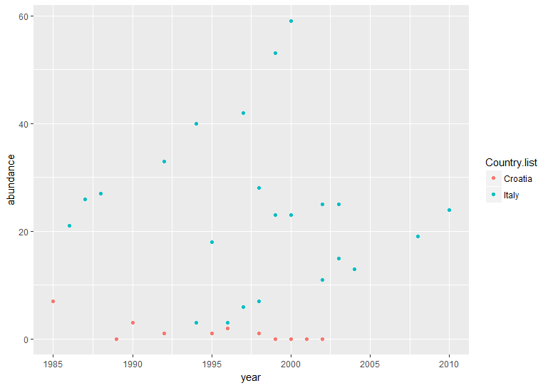
Hopefully by now we’ve convinced you of the perks of ggplot2, but again like with the histogram, the graph above needs a bit more work.
(vulture_scatter <- ggplot(vultureITCR, aes (x = year, y = abundance, colour = Country.list)) +
    geom_point(size = 2) +                                               # Changing point size
    geom_smooth(method = "lm", aes(fill = Country.list)) +               # Adding linear model fit, colour-code by country
    theme_bw() +
    scale_fill_manual(values = c("#EE7600", "#00868B")) +                # Adding custom colours for solid geoms (ribbon)
    scale_colour_manual(values = c("#EE7600", "#00868B"),                # Adding custom colours for lines and points
                        labels = c("Croatia", "Italy")) +                # Adding labels for the legend
    ylab("Griffon vulture abundance\n") +
    xlab("\nYear")  +
    theme(axis.text.x = element_text(size = 12, angle = 45, vjust = 1, hjust = 1),     # making the years at a bit of an angle
          axis.text.y = element_text(size = 12),
          axis.title = element_text(size = 14, face = "plain"),
          panel.grid = element_blank(),                                   # Removing the background grid lines
          plot.margin = unit(c(1,1,1,1), units = , "cm"),                 # Adding a 1cm margin around the plot
          legend.text = element_text(size = 12, face = "italic"),         # Setting the font for the legend text
          legend.title = element_blank(),                                 # Removing the legend title
          legend.position = c(0.9, 0.9)))                                 # Setting legend position - 0 is left/bottom, 1 is top/right
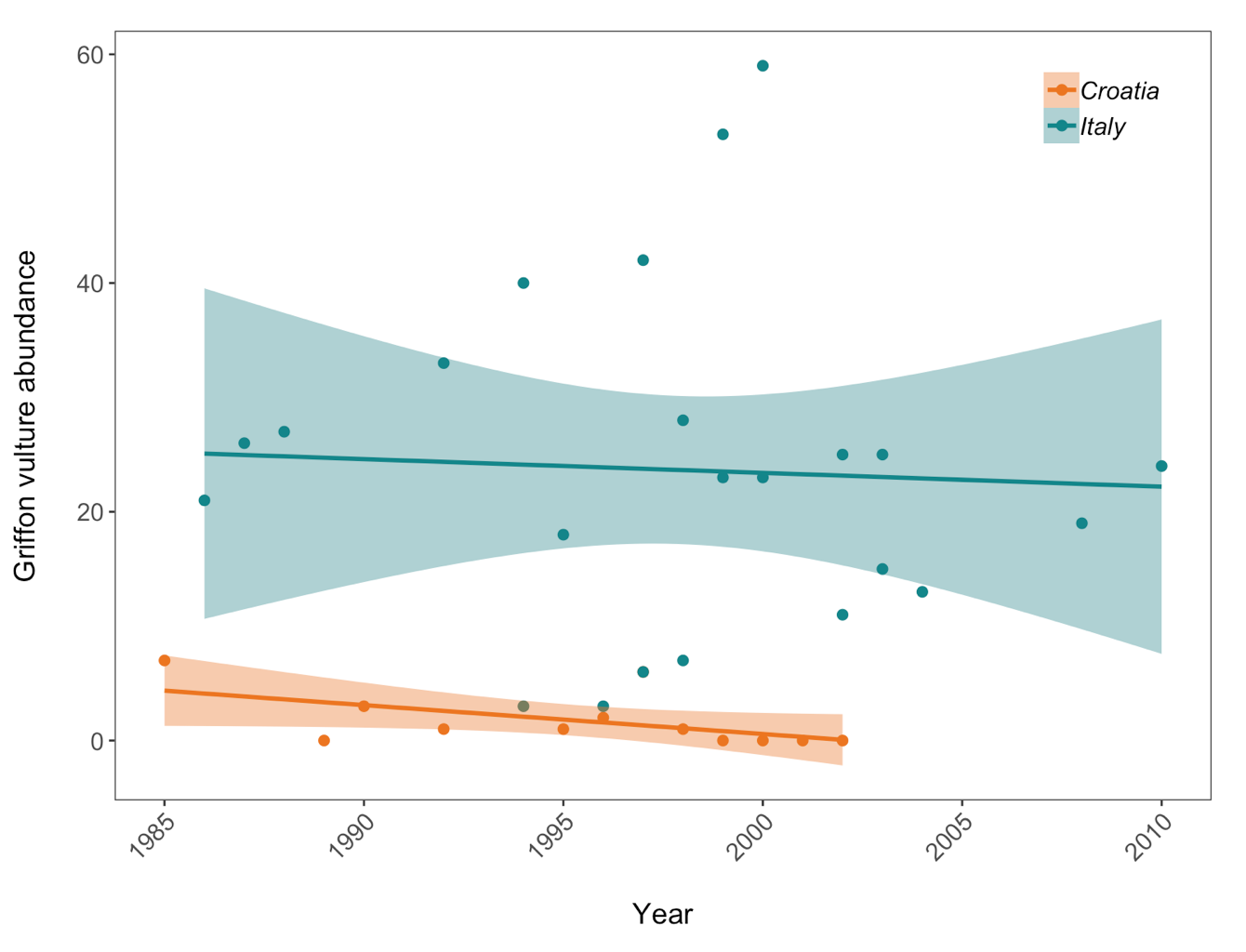 Population trends of Griffon vulture in Croatia and Italy. Data points represent raw data with a linear model fit and 95% confidence intervals. Abundance is measured in number of breeding individuals.”
Good to know
If your axis labels need to contain special characters or superscript, you can get ggplot2 to plot that, too. It might require some googling regarding your specific case, but for example, this code ylabs(expression(paste('Grain yield',' ','(ton.', ha^-1, ')', sep=''))) will create a y axis with a label reading Grain yield (ton. ha-1).
To create additional space between an axis title and the axis itself, use \n when writing your title, and it will act as a line break.
3c. Boxplot to examine whether vulture abundance differs between Croatia and Italy
Box plots are very informative as they show the median and spread of your data, and allow you to quickly compare values among groups. If some boxes don’t overlap with one another, you probably have significant differences, and it’s worth to investigate further with statistical tests.
(vulture_boxplot <- ggplot(vultureITCR, aes(Country.list, abundance)) + geom_boxplot())

# Beautifying

(vulture_boxplot <- ggplot(vultureITCR, aes(Country.list, abundance)) +
    geom_boxplot(aes(fill = Country.list)) +
    theme_bw() +
    scale_fill_manual(values = c("#EE7600", "#00868B")) +               # Adding custom colours
    scale_colour_manual(values = c("#EE7600", "#00868B")) +             # Adding custom colours
    ylab("Griffon vulture abundance\n") +
    xlab("\nCountry")  +
    theme(axis.text = element_text(size = 12),
          axis.title = element_text(size = 14, face = "plain"),
          panel.grid = element_blank(),                                 # Removing the background grid lines
          plot.margin = unit(c(1,1,1,1), units = , "cm"),               # Adding a margin
          legend.position = "none"))                                    # Removing legend - not needed with only 2 factors
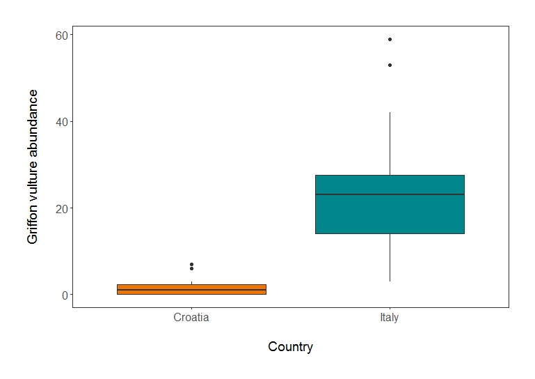 Griffon vulture abundance in Croatia and Italy.”
3d. Barplot to compare species richness of a few European countries
We are now going to calculate how many species are found in the LPI dataset for some European countries, and plot the species richness.
# Calculating species richness using pipes %>% from the dplyr package
richness <- LPI2 %>% filter (Country.list %in% c("United Kingdom", "Germany", "France", "Netherlands", "Italy")) %>%
            group_by(Country.list) %>%
            mutate(richness = (length(unique(Common.Name)))) # create new column based on how many unique common names (or species) there are in each country

# Plotting the species richness
(richness_barplot <- ggplot(richness, aes(x = Country.list, y = richness)) +
    geom_bar(position = position_dodge(), stat = "identity", colour = "black", fill = "#00868B") +
    theme_bw() +
    ylab("Species richness\n") +
    xlab("Country")  +
    theme(axis.text.x = element_text(size = 12, angle = 45, vjust = 1, hjust = 1),  # Angled labels, so text doesn't overlap
          axis.text.y = element_text(size = 12),
          axis.title = element_text(size = 14, face = "plain"),
          panel.grid = element_blank(),
          plot.margin = unit(c(1,1,1,1), units = , "cm")))
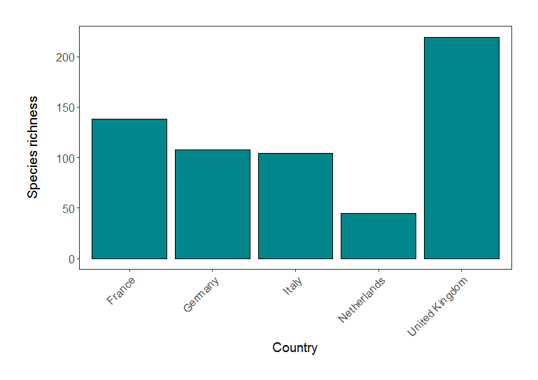 Species richness in five European countries (based on LPI data).
4. Using facets and creating panels
Sometimes, displaying all the data on one graph makes it too cluttered. If we wanted to examine the population change of vultures across all the countries, rather than Italy and Croatia, we would have 10 populations on the same graph:
# Plot the population change for all countries
(vulture_scatter_all <- ggplot(vulture, aes (x = year, y = abundance, colour = Country.list)) +
      geom_point(size = 2) +                                               # Changing point size
      geom_smooth(method = "lm", aes(fill = Country.list)) +               # Adding linear model fit, colour-code by country
      theme_bw() +
      ylab("Griffon vulture abundance\n") +
      xlab("\nYear")  +
      theme(axis.text.x = element_text(size = 12, angle = 45, vjust = 1, hjust = 1),     # making the years at a bit of an angle
            axis.text.y = element_text(size = 12),
            axis.title = element_text(size = 14, face = "plain"),
            panel.grid = element_blank(),                                   # Removing the background grid lines
            plot.margin = unit(c(1,1,1,1), units = , "cm"),                 # Adding a 1cm margin around the plot
            legend.text = element_text(size = 12, face = "italic"),         # Setting the font for the legend text
            legend.title = element_blank(),                                 # Removing the legend title
            legend.position = "right"))
That’s cluttered! Can you really figure out what populations are doing? By adding a facetting layer, we can split the data in multiple facets representing the different countries. This is done using facet_wrap().
# Plot the population change for countries individually
(vulture_scatter_facets <- ggplot(vulture, aes (x = year, y = abundance, colour = Country.list)) +
      geom_point(size = 2) +                                               # Changing point size
      geom_smooth(method = "lm", aes(fill = Country.list)) +               # Adding linear model fit, colour-code by country
      facet_wrap(~ Country.list, scales = "free_y") +                      # THIS LINE CREATES THE FACETTING
      theme_bw() +
      ylab("Griffon vulture abundance\n") +
      xlab("\nYear")  +
      theme(axis.text.x = element_text(size = 12, angle = 45, vjust = 1, hjust = 1),     # making the years at a bit of an angle
            axis.text.y = element_text(size = 12),
            axis.title = element_text(size = 14, face = "plain"),
            panel.grid = element_blank(),                                   # Removing the background grid lines
            plot.margin = unit(c(1,1,1,1), units = , "cm"),                 # Adding a 1cm margin around the plot
            legend.text = element_text(size = 12, face = "italic"),         # Setting the font for the legend text
            legend.title = element_blank(),                                 # Removing the legend title
            legend.position = "right"))
Some useful arguments to include in facet_wrap()are nrow = or ncol = , specifying the number of rows or columns, respectively. You can also see that we used scales = "free_y", to allow different y axis values because of the wide range of abundance values in the data. You can use “fixed” when you want to constrain all axis values.
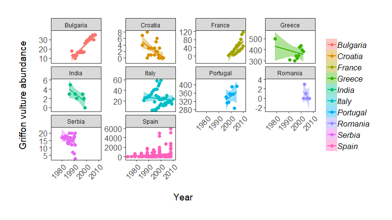 Population change of Griffon vulture across the world, from the LPI dataset.”
Note: some of these population trends do weird things, possibly because there are many sub-populations being monitored within a country (e.g. Italy), so in practice we probably would not fit a single regression line per country.
And finally, sometimes you want to arrange multiple figures together to create a panel. We will do this using grid.arrange() from the package gridExtra.
grid.arrange(vulture_hist, vulture_scatter, vulture_boxplot, ncol = 1)

# This doesn't look right - the graphs are too stretched, the legend and text are all messed up, the white margins are too big

# Fixing the problems - adding ylab() again overrides the previous settings

(panel <- grid.arrange(
      vulture_hist + ggtitle("(a)") + ylab("Count") + xlab("Abundance") +   # adding labels to the different plots
      theme(plot.margin = unit(c(0.2, 0.2, 0.2, 0.2), units = , "cm")),

      vulture_boxplot + ggtitle("(b)") + ylab("Abundance") + xlab("Country") +
      theme(plot.margin = unit(c(0.2, 0.2, 0.2, 0.2), units = , "cm")),

      vulture_scatter + ggtitle("(c)") + ylab("Abundance") + xlab("Year") +
      theme(plot.margin = unit(c(0.2, 0.2, 0.2, 0.2), units = , "cm")) +
      theme(legend.text = element_text(size = 12, face = "italic"),
            legend.title = element_blank(),
            legend.position = c(0.85, 0.85)), # changing the legend position so that it fits within the panel

      ncol = 1)) # ncol determines how many columns you have
If you want to change the width or height of any of your pictures, you can add either ` widths = c(1, 1, 1) or heights = c(2, 1, 1)` for example, to the end of your grid arrange command. In these examples, this would create three plots of equal width, and the first plot would be twice as tall as the other two, respectively. This is helpful when you have different sized figures or if you want to highlight the most important figure in your panel.
To get around the too stretched/too squished panel problems, we will save the file and give it exact dimensions using ggsave from the ggplot2 package. The default width and height are measured in inches. If you want to swap to pixels or centimeters, you can add units = "px" or units = "cm" inside the ggsave() brackets, e.g. ggsave(object, filename = "mymap.png", width = 1000, height = 1000, units = "px". The file will be saved to wherever your working directory is, which you can check by running getwd() in the console.
ggsave(panel, file = "vulture_panel2.png", width = 5, height = 12)
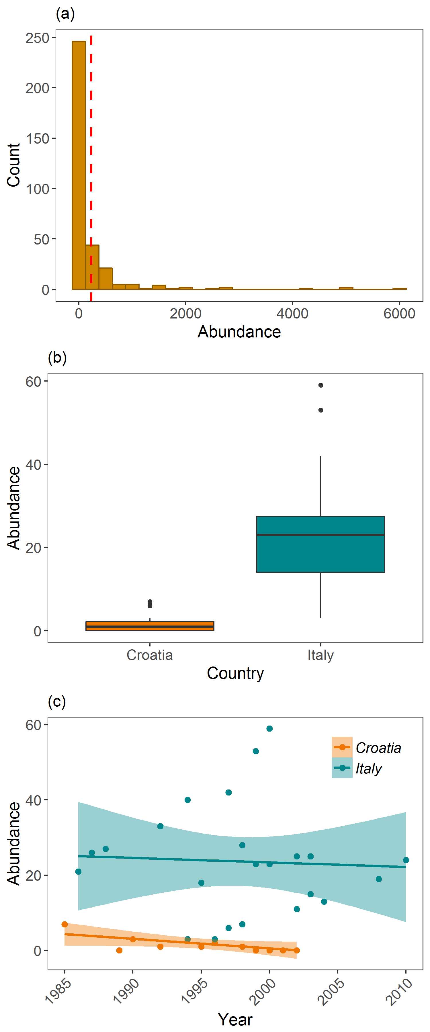 Examining Griffon vulture populations from the LPI dataset. (a) shows histogram of abundance data distribution, (b) shows a boxplot comparison of abundance in Croatia and Italy, and (c) shows population trends between 1970 and 2014 in Croatia and Italy.”
And there you go, you can now make all sorts of plots and start customising them with ggplot2!
5. Challenge yourself!
To practice making graphs, go back to the original LPI dataset that you imported at the beginning of the tutorial. Now, can you:
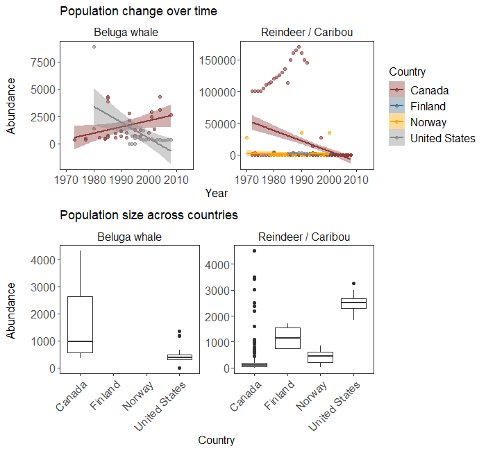
1 - Choose TWO species from the LPI data and display their population trends over time, using a scatterplot and a linear model fit?
2 - Using the same two species, filter the data to include only records from FIVE countries of your choice, and make a boxplot to compare how the abundance of those two species varies between the five countries?
# I chose two Arctic animals
arctic <- filter(LPI2, Common.Name %in% c('Reindeer / Caribou', 'Beluga whale'))

# GRAPH 1 - POPULATION CHANGE OVER TIME

(arctic.scatter<- ggplot(arctic, aes(x = year, y = abundance)) +
   geom_point(aes(colour = Country.list), size = 1.5, alpha = 0.6) +                # alpha controls transparency
   facet_wrap(~ Common.Name, scales = 'free_y') +                                   # facetting by species
   stat_smooth(method = 'lm', aes(fill = Country.list, colour = Country.list)) +    # colour coding by country
   scale_colour_manual(values = c('#8B3A3A', '#4A708B', '#FFA500', '#8B8989'), name = 'Country') +
   scale_fill_manual(values = c('#8B3A3A', '#4A708B', '#FFA500', '#8B8989'), name = 'Country') +
   labs(x = 'Year', y = 'Abundance \n') +
   theme_bw() +
   theme(panel.grid = element_blank(),
         strip.background = element_blank(),
         strip.text = element_text(size = 12),
         axis.text = element_text(size = 12),
         axis.title = element_text(size = 12),
         legend.text = element_text(size = 12),
         legend.title = element_text(size = 12))
)

# GRAPH 2 - BOXPLOTS OF ABUNDANCE ACROSS FIVE COUNTRIES

# Only have four countries so no subsetting; let's plot directly:
(arctic.box <- ggplot(arctic, aes(x = Country.list, y = abundance)) +
   geom_boxplot() +
   labs(x = 'Country', y = 'Abundance \n') +
   theme_bw() +
   facet_wrap(~Common.Name, scales = 'free_y') +
   theme(panel.grid = element_blank(),
         strip.background = element_blank(),
         strip.text = element_text(size = 12),
         axis.text = element_text(size = 12),
         axis.title = element_text(size = 12),
         legend.text = element_text(size = 12),
         legend.title = element_text(size = 12))
)

# Not great because of high-abundance outliers for reindeer in Canada - let's remove them for now (wouldn't do that for an analysis!)
(arctic.box <- ggplot(filter(arctic, abundance < 8000), aes(x = Country.list, y = abundance)) +
      geom_boxplot() +
      labs(x = 'Country', y = 'Abundance \n') +
      theme_bw() +
      facet_wrap(~Common.Name, scales = 'free_y') +
      theme(panel.grid = element_blank(),
            strip.background = element_blank(),
            strip.text = element_text(size = 12),
            axis.text = element_text(size = 12),
            axis.text.x = element_text(angle = 45, hjust = 1),
            axis.title = element_text(size = 12))
)

#Align together in a panel - here I use the egg package that lines up plots together regardless of whether they have a legend or not

library(egg)

ggarrange(arctic.scatter + labs(title = 'Population change over time'),
          arctic.box + labs(title = 'Population size across countries'))